Not every room in a home or building is blessed with the uplifting effects of gorgeous natural light.
Depending on where the property is situated, you might have one, two or multiple low-light rooms.
Clean and clinical white or bright and bold colours are often envisaged to lighten up a low-light room, however they mostly have the opposite effect.
Want to know the best colours to use for low-light rooms? Read more from the professional Perth painters at Contrast Painting to find out.
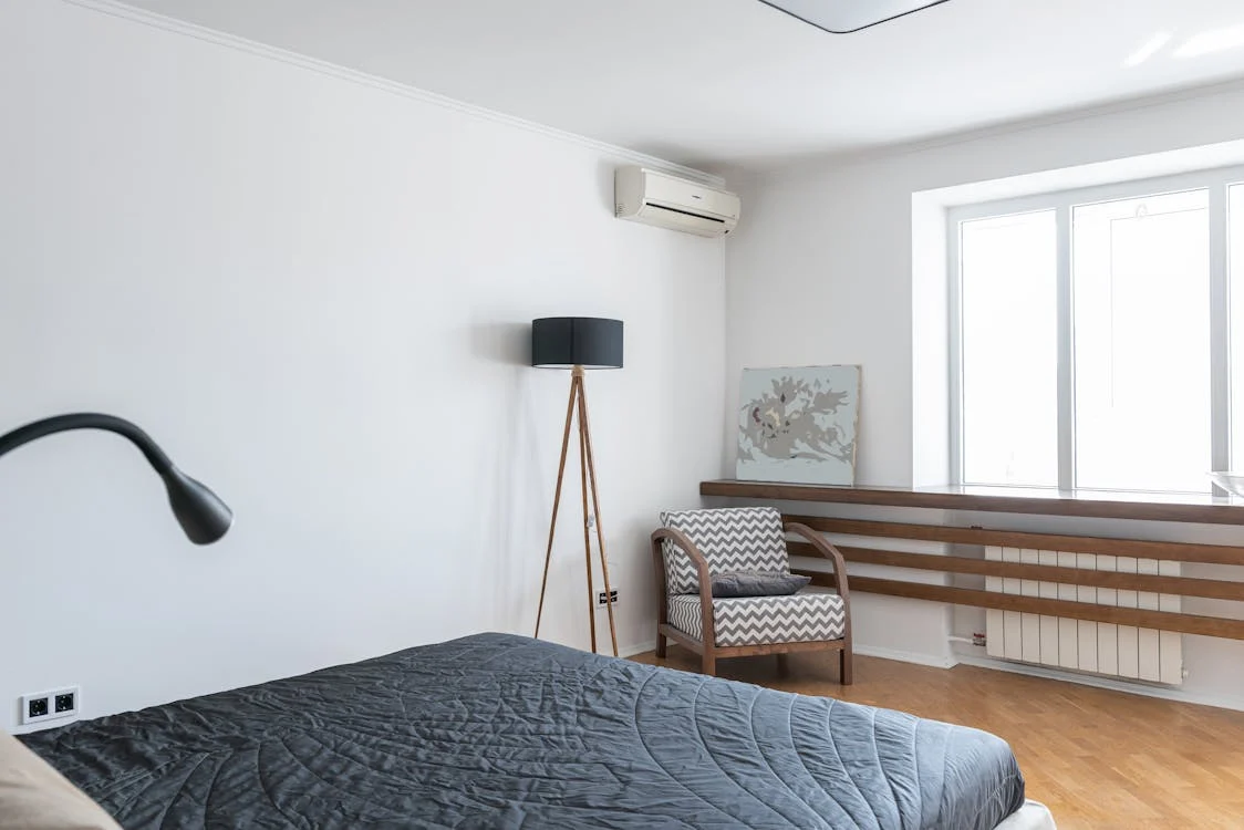
Soft grey tones
Did you know that rooms with low natural lighting are more susceptible to shadow and grey tones? This will draw out cool colours, making the room feel darker than it already is.
If you’re wanting to go with cooler colours for your lightless room, you can give it a welcomed boost with some warm undertones from soft greys.
How does it work?
· Their beige undercurrents soften the grey, working nicely in a bedroom.
· Try a matte or satin finish in more frequented, low-light areas.
When the right grey shades are used and the right painting techniques from the right residential painter Perth are employed – you will be in awe at how grey can successfully brighten up your space.
Sunshine style
Looking to inject some cheer and happiness to a dimly lit area?
You can do so with sunny yellow – but it really needs to be done right.
A great way to do this is ensuring you have enough artificial light capabilities within the room or space, so the yellow paint doesn’t fall flat.
Lovely lavender
Rely on the medium-tone of lavender, heightened with a warm under hue.
Consider lavender in eggshell or satin gloss for a low-light dining room.
Lavender colourings are both versatile and inviting, working well with white, black or grey furniture.
Orange enrichment
Orange might seem too bold for the masses, but when done thoughtfully – it can really enrich a low-light space.
Think pumpkin, tangerine or apricot colourings for inspiration which will work remarkably well where people naturally gather such as a kitchen or dining room.
Airy and bright powder blue
Who says you can’t feel like you’re floating on a soft, pillowy cloud in the beautiful blue sky whilst indoors?
With powder blue paint colour in a darkened area (or areas) of your home you really, truly can encapsulate this feeling.
Get pretty with pink
The colour pink is making a welcomed return in interior design. Plenty of pink paint colours brighten up dull, dark spaces and provide personality into the mix, too.
Soft, pastel pink tones add a hint of colour to low-light rooms and areas without ever being too overwhelming.
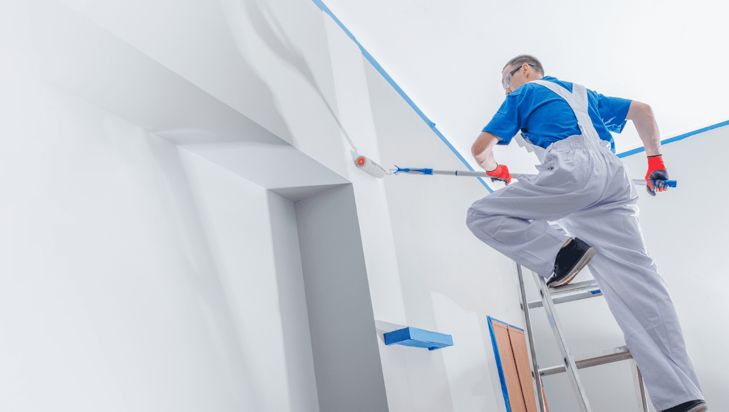
Contrast Painting are the Perth painters you need
At Contrast Painting, we work hard to provide our unique European quality service on time and within budgets.
Our painting services encompass residential, commercial and even specialist/decorative spheres and no painting project is too big or too small.
Looking for a professional painter in Perth? Contact Contrast Painting today for always reliable, always professional painters who consistently provide quality painting results.