A commercial premise will look very different, design and colour wise, to that of your house. Unless, of course, you run your business from home.
First impressions count, including the one you get when entering a business for the first time.
So, whether you own and operate a retail outlet, cafe or restaurant, healthcare centre, educational facility, place of worship or any other business, it’s important to make yours count.
Want to know more about the colours that are suitable for your commercial premises?
Read more from the Perth commercial painting team at Contrast Painting to find out.
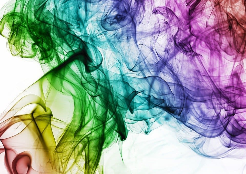
Look into the psychology of colour
Did you know that different colours can evoke different emotions in people? Keep this in mind when considering the paint colours for your commercial premise.
Let’s take a look at some examples:
· Red and its various shades encourage leadership and development in the office.
· Green and its various shades often make people feel connected to nature.
· Shades of blue can create a sense of calmness to a fast-paced, high-traffic atmosphere.
While shades of white are crisp and clean, they don’t have to always be the go-to shades all the way through your commercial premise.
Consider your surroundings
You may have bold ideas and tastes when it comes to painting your commercial premise. However, depending on the type and location of your building, you may be subject to rules and restrictions.
What does this mean?
· Ensuring your building’s paint work is up to code is almost always essential for commercial zones.
· Historical buildings will generally have restrictions surrounding the colours you can and cannot use.
Even if your commercial premise isn’t bound by the above restrictions, or other variations, you should still definitely choose exterior commercial colours that stand out but look proportional with surrounding buildings.
Keep it ‘on-brand’ and leverage complementary colours
If you have a thriving, established business already – you likely have a business brand with brand colours. Did you know that having and utilising brand colours can improve recognition with consumers by up to 80%?
What does this mean?
· Combining your brand logo and specific colour combinations throughout the interior and exterior of your commercial premise.
· It’s time to consult a professional commercial painter in Perth to discuss the best colour combinations that will look good and be recognisable.
Contrast Painting know the colours that don’t inspire warehouse workers (white, beige and greys), the colours that will grab a shopper’s attention, and the best colours to evoke clarity and productivity.
Contrast Painting are the Perth commercial painters you need
There’s no one size fits all when it comes to choosing the right colour pallet for your business. However, there’s location, building type and business style factors that all influence choosing the best possible colours.
Contrast Painting have the expertise and skillset to help you understand and utilise the most suitable, attractive colours and decorative finishes for your commercial premise.
Need a commercial painter in Perth?
Contact Contrast Painting today for all the colour advice, professional painting services and maintenance you need.